Choosing the paint shade for a nursery may not seem like a top priority among all the considerations that come with having a baby.
But believe me, while your newly designed baby room should feel soothing for both you and your baby, it might not be crucial for your baby—it’s more essential for you yourself. This is because you need to set the mood in a room where you’ll spend a lot of time with your little one.
While paint color is significant, remember that other elements like rugs, curtains, and art also contribute to creating a relaxing atmosphere. So, starting with a proper plan can help you stay focused and ensure a cohesive, calming environment that supports the comfort and well-being of both you and your baby.
By thoughtfully combining these elements, you can create a space that is both functional and aesthetically pleasing, making those early days and nights more enjoyable for you and your baby.
What's Here in the Article:
Nursery Paint Color Ideas for Your Little One
Looking for nursery paint colors? Don’t know what would be the best color for a baby’s room? Don’t worry. We’ve compiled a list of the top nursery color schemes to help you boost your nursery decor.
Whether you want the nursery color palette to instill sentiments of comfort and warmth, or you’re searching for a relaxing color scheme. Or perhaps you are interested in color psychology and how it might assist you in choosing nursery colors. Whatever the situation may be, you will undoubtedly find inspiration.
To help you start your repaint and redesigning job, here are some of my favorite nursery paint color choices…
1. Pink
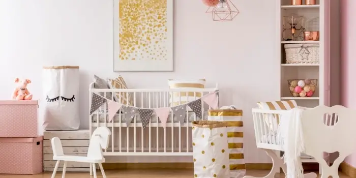
Pink has been found in studies to have a soothing impact on the human mind and reduce aggressive behavior. It also evokes warm and comforting sentiments, which may aid in your child’s relaxation. Additionally, pink conveys unconditional love and compassion, making it an excellent choice for a baby’s nursery.
Choose a delicate, peachy tone or a dusty pastel and apply sparingly, balancing the color with lots of neutral space to keep your child calm and happy.
2. Yellow
Yellow is connected with optimism and happiness, so it’s a natural choice for your baby’s nursery. However, instead of using strong, harsher tones like lemon or neon, try some gentler alternatives like daffodil or dandelion. The warmth these shades emit creates a relaxing ambiance.
Floral wallpaper with a yellow background might also be a great way to start if you want to add a touch of whimsy and charm to the room. This can be paired with white or light-colored furniture to balance the brightness of the yellow and keep the overall look soft and inviting.
Additionally, consider incorporating accents in complementary colors such as soft greens or blues to enhance the cheerful yet soothing atmosphere. This approach ensures that the nursery is a joyful, calming space for both you and your baby.
3. Earthy Neutral
Neutral earth tones offer a warm, anchoring influence and may help you create a homey ambiance while being quite easy on the eyes. This is the reason earthy beige and brown tones are known to provide your baby’s growing eyes a much-needed break from exciting color and contrast, helping your little dreamer to unwind and sleep.
If your goal is to create a serene and comforting environment, incorporating these soothing hues can be highly beneficial. Pair these tones with natural materials such as wooden furniture, woven baskets, and soft textiles to enhance the cozy feel of the nursery.
You might also consider adding gentle accents like soft greens or creams to keep the room feeling fresh and balanced. These calming shades and textures will definitely help promote relaxation and restfulness, which is essential for your baby’s development and your own peace of mind.
4. Subdued Blue
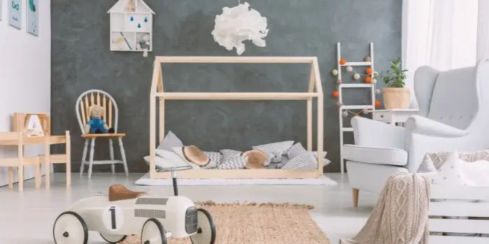
Blue light is known to reduce anxiety, aggressiveness, blood pressure, and heart rate, cooling the body and preparing it for better sleep. It’s like a natural remedy for apprehensive babies and tantrum-prone children.
However, avoid dark blues if you want to create a sleep-centered environment. While light to medium colors support sleep, deep and dramatic blues have a stimulating impact, preventing sleep.
Colors that are soft and relaxing, such as aqua, powder blue, or even mild tints of turquoise, and the shades that resemble a peaceful sea or a clear sky are a much safer pick. These tend to soothe both mind and body, giving us the impression that everything is well in the world.
5. Sage Green
Sage green, with grey undertones, is a versatile and beautiful nursery paint color. Especially if you pair the sage green nursery accent wall, with soft neutrals, it creates a peaceful atmosphere in the area.
Additionally, sage green has been associated with promoting relaxation and reducing stress, which can be beneficial for both you and your baby. When combined with natural light and cozy furnishings, this soothing hue creates a welcoming sanctuary where you can bond with your little one and create cherished memories together.
6. Dark Green
The gorgeous dark green accent wall in the nursery decor also has the effect of slowing us down. When wisely used to decorate the room, it provides a sense of tranquility and balance, making it perfect for a space dedicated to nurturing and comfort.
Dark green also helps to provide your baby’s room with a mysterious, elegant airy feel particularly when you use it with warm woods, creams, whites, and leather accessories.
7. Teal Serene
Teal is another great option if you can’t decide between blue and green for your child’s nursery. Blue greens, such as mint or seafoam, are also wonderful choices since they combine the relaxing properties of both hues.
As an added plus, teal is a gender-neutral color that blends nicely with various colors and styles, giving you lots of options for decor and theme. It’s a well-known shade for creating a sense of balance, which may be a much-needed comfort for your small one.
8. Peach
Peach, as an alternative to pink, may also be an excellent color option for nurseries. Particularly when combined with neutrals or cold tones, this shade creates a calm ambiance that may lift moods without being overpowering. Because of its adaptability, this hue may be used for many years as your kid gets older.
Still on the fence about utilizing a peach tone? Try using it as an accent wall. Having one portion devoted to that color will help you decide whether to go all-in and balancing it with printed wallpaper can do wonders for the peace you’re aiming for.
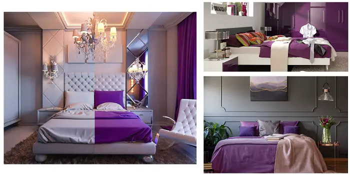
9. Pale Purple
Purple, which is associated with wisdom and spirituality, mixes the calming attributes of blue with the loving femininity of pink. Lavender and lilac, for example, produce a calm and tranquil environment but only in very weak tints. If you choose an excessively dark hue, your nursery may seem dismal.
To guarantee a suitable selection, keep in mind that purple will nearly always seem darker on the wall than planned. So, you’ll be satisfied with the results if you choose a color that is at least one shade lighter than your initial pick.
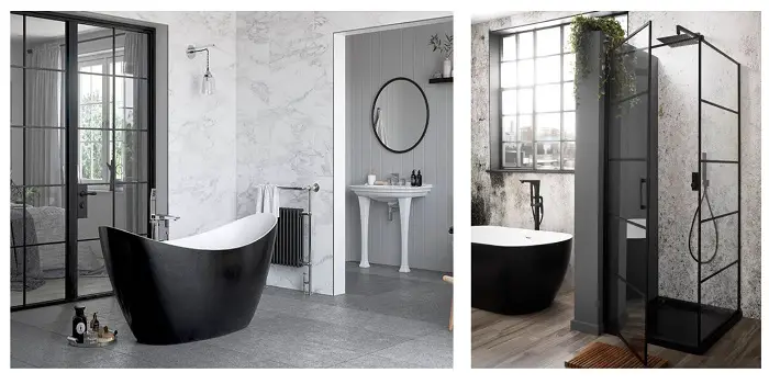
10. Soft Black
Utilizing soft black paint in the nursery immediately infuses the space with depth and drama, creating a striking visual impact.
It pairs exquisitely with contrasting elements such as whites, brass, or gold finishes, and an array of textures, adding richness and sophistication to the ambiance.
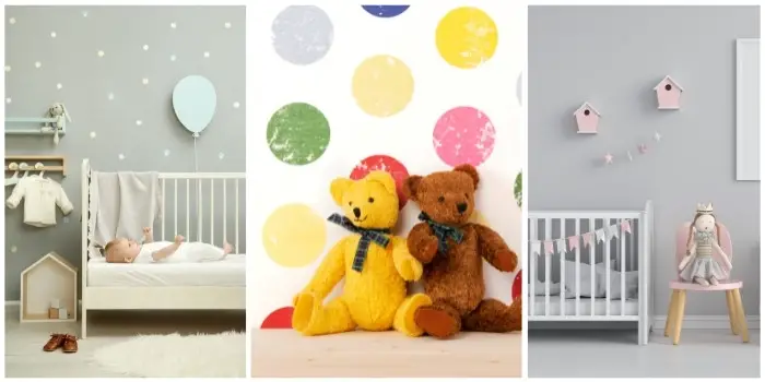
11. Gray
Gray paint emerges as an incredibly versatile option for nursery decor, offering a spectrum of tones and styles to suit any aesthetic.
From ethereal, luminous grays that impart a sense of serenity to deeper hues that evoke a cozy, cocoon-like atmosphere, the possibilities are endless.
12. White
The versatility of white paint knows no bounds, with an abundance of undertones, finishes, and shades to tailor the nursery’s ambiance to your exact specifications.
Whether you opt for calming, muted whites to foster a tranquil environment or opt for crisp, bright whites for a more vibrant feel, white paint offers boundless potential.
13. Cream
Choosing cream for nursery paint evokes timeless elegance, imbuing the space with a sense of warmth and sophistication.
Layering textures, incorporating complementary bright colors, and integrating playful patterns can further enhance the tranquil and inviting atmosphere of the nursery.
14. Greige
Greige, the epitome of contemporary chic, seamlessly blends the sophistication of gray with the warmth of beige, resulting in a hue that is both versatile and effortlessly stylish.
Its neutral undertones make it a perfect canvas for complementing a wide array of colors and design motifs, ensuring a harmonious and visually appealing nursery space.
15. Terra Cotta
Infusing terra cotta into the nursery decor injects a vibrant energy into the space, creating a nurturing and invigorating environment for the baby.
The earthy richness of terra cotta, particularly when juxtaposed with soft pink accents, imparts a sense of warmth and harmony, fostering a cozy and welcoming ambiance.
Tips for Choosing the Best Colors for a Boy’s or a Girl’s Nursery?
Color psychology is crucial in designing a nursery that not only appears attractive but also fosters a healthy setting for your baby’s development. Therefore, when choosing colors for your nursery, consider the room’s size along with the furniture and other decor pieces present there.
When picking the colors that work best for your boy or girl nurseries you should avoid using too much black or white in the room as these shades can be quite harsh on a baby’s eyes. If you desire to add black/white, focus on using their softer shades to create a more calming atmosphere.
Wherever possible try to introduce colors through accents such as rugs, curtains, and wall art to achieve a harmonious and unified appearance. Then take into account the amount of natural light the room gets; if the room receives plenty of light, cooler colors will work well. Conversely, if the room has less natural light, warmer colors will help make the space feel cozier.
When it comes to the type of safest paint to use in a baby’s nursery, opt for the ones with low or zero volatile organic compounds as these chemicals when released into the air (as the paint dries) can cause various health symptoms.
The conclusion
Selecting the perfect paint color for your nursery is a deeply personal decision, one that goes beyond mere aesthetics to create a comforting and nurturing environment for your little one. Whether you opt for the timeless elegance of soft black or the versatile charm of greige, each color has the power to transform the space into a sanctuary of love and warmth.
By carefully considering the mood, style, and ambiance you wish to cultivate, you can create a nursery that not only delights the senses but also provides a soothing retreat for both baby and parents alike. With the above comforting paint colors as your palette, the journey to designing the perfect baby’s room is sure to be filled with joy and inspiration.
Share the post "15 Comforting Paint Colors for Nursery (Baby’s Room)"

Douglas Becker (aka Painter Doug) has over twenty years of experience as a painter in Adkins, Texas. At present, he resides in Florida with his family.
From painting multi-storeyed houses, condos, and apartments to large commercial buildings and small offices, he had served various customers in areas not only in Adkins but also in Southwest Florida, Sarasota, Naples, and many more. To know more about him check here.


