
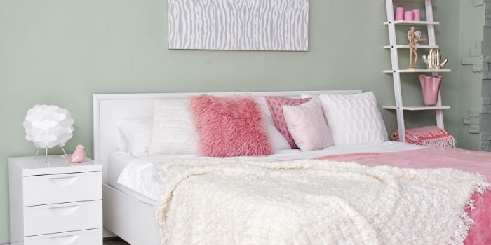
Pink and white, a timeless duo, radiate elegance, freshness, and charm across various aspects of our lives. Whether in fashion, home décor, or event planning like weddings and birthday parties, these colors offer a versatile foundation that pairs effortlessly with a myriad of complementary shades.
But what colors complement pink and white best? The answer lies in the mood and style you aim to evoke.
While nearly any shade of pink can harmonize with various color schemes, certain hues stand out as exceptional companions. In this article, we’ll delve into a spectrum of color pairings, ranging from classic to bold and bright choices, to help you craft the perfect palette for any occasion.
What's Here in the Article:
Paint Colors that Pairs With Pink and White
Whether your goal is to introduce a burst of color, cultivate a serene ambiance, or make a bold statement, we’ve got you covered. Join us as we explore the realm of colors and unlock the full potential of pink and white…
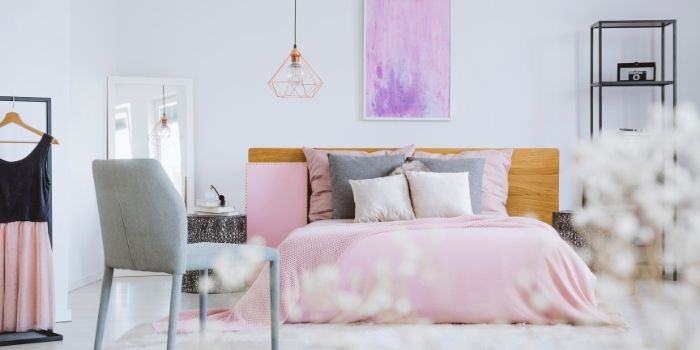
1. Blue
Blue may seem to be a daring hue to mix with pink, but this combo demonstrates that opposites do attract.
You may also tone it down with the soft pinks and light blues, as well as the all-white design, to get a really quiet and relaxing area.
Pink, white, and blue go well together not because they compliment each other (albeit when combined with yellow, they make a triad), but because they are traditionally seen as opposites.
We’ve mistakenly come to think that pink is for girls and blue is for guys; therefore, placing them together creates some kind of color harmony.
Pink and blue may work together in the house if you experiment with various colors.
And it looks even more beautiful when you have white color as well, maybe on the ceiling, or white furniture or curtains to go with.
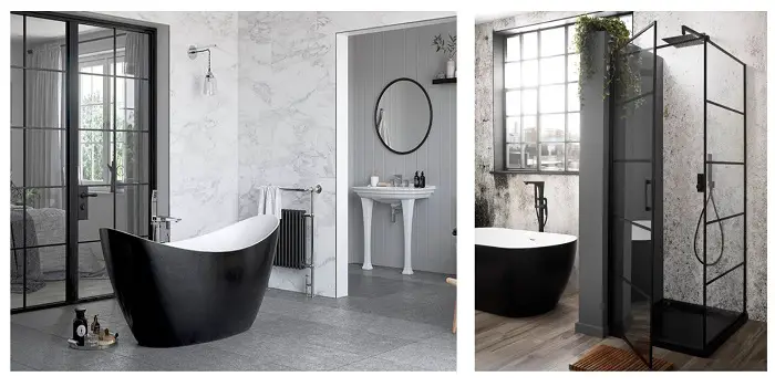
2. Black
A few splashes of pink and black can do the job if you want to give your neutral home a more vivid vibe.
Black grounds and balances the lively, cheerful mood that pink offers to a place when paired with pinks of any hue.
Pink and black are some of my favorite color combinations.
When combined with pink, black has a strong and dramatic effect, and it may generate lushness and depth to the area with neutral colors like white.
3. Green
Green and pink complement each other in the same way as white and black do.
Because outdoor weddings are so popular, pink and green are an obvious color combination as blush stands out against the greens of the foliage and grass.
At home, emerald and blush work very well together.
You can complement it with a white curtain or white sofa. This combination will enhance the look of any living space.
4. Red
I honestly feel that everything goes when it comes to color and design. While you should have an overarching vision and color scheme in mind for your space, I believe we should feel free to mix and match what we want.
When curated properly, any hue may go together, which is why I feel (for the most part) clashing is a thing of the past.
Red and pink are excellent illustrations of this as these are fiery, vibrant, and powerful tones that work well together.
While this daring combination is not for everyone, if you did right, you can get a charming, energetic, and luxurious environment. For example, a bedroom with white sheets, pink pillows, quilts and rugs, and red textured wallpaper.
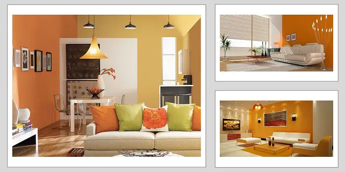
5. Orange
Orange and pink, like red and pink, complement each other nicely since they are from the same color wheel area.
But it doesn’t mean you can’t make some very great, strong clashes using complementary colors.
The palest of pinks combined with a vibrant orange and some lighter undertone colors like white create such a cheerful vibe in the kid’s room, and of course, they would look just as trendy in an adult space as well.
Using a bright orange helps a pastel pink look less saccharine sweet, and edgier.
6. Yellow
Choosing a chalky plaster pink and then slicing it with a zingy almost fluorescent yellow may be quite eye-catching.
Despite the fact that the pink and yellow are on the more subdued side, the area is nonetheless lively and enjoyable.
A neutral accent like white will help balance the warmer tones and make the area seem light and airy. This beautiful combo can be very uplifting. After all, yellow is the color of optimism, and pink always adds a positive vibe to a place.
7. Gold
Simply sprinkle accents of gold around a stunning pink wedding to add class and elegance. Aside from weddings, pale pink and gold look stunning together in a Mid-Century Modern house.
Pink is one of those colors strongly linked with the period, and it looks great with the gold embellishments featured in a lot of Mid-century Modern furniture.
8. Gray
Grey fits with almost everything as a neutral color, but the gentle tint of baby pink looks particularly beautiful with a cold grey.
Baby pink is used to soften industrial decor at home, so you can complement your soft pink with a gray concrete wall and white curtains. This combination will give a charming and soft vibe.
9. Teal
Teal and pink as a color combination have gone a long way in recent years. While it used to read as childish, there are now innumerable bold and gorgeous ways to mix these two color jewels.
The hotter the teal, the stronger the impact, and the same is true for pink.
Using these vibrant, rich tones in an otherwise neutral environment brings room to life and makes it more enjoyable.
10. Dark brown
Brown is associated with the ground, warmth, healing, and stability. The color combination, when combined with pink and white, gives off a cozy, welcoming vibe.
This is why it is popular in boho chic and rustic-styled interiors.
In terms of fashion, pink and brown seem gentle and feminine combined without being too loud.
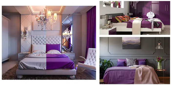
Are Metallics a Good Choice to Pair with Pink and White?
Metallics indeed bring a touch of glamour and sophistication to a color palette, and they often harmonize beautifully with pink and white. Here’s how various metallic options can complement pink and white:
Silver Offers a cool, sleek contrast, silver adds a contemporary and elegant touch to the warmth of pink, creating a sophisticated look.
Gold introduces luxury and richness to the softness of pink and white, infusing a glamorous and opulent feel into the palette.
Combining the warmth of pink with the richness of gold, rose gold brings a romantic and trendy aesthetic to the mix, complementing both colors seamlessly.
Bronze imparts a rustic or vintage charm to the combination of pink and white, offering an earthy and warm tone that adds depth to the palette.
Whether integrated through decor, accessories, or clothing, metallics elevate the overall aesthetic and infuse visual interest into your pink-and-white color scheme.
How Do Patterns and Textures Enhance Pink-White Combination?
Patterns and textures play an indispensable role in amplifying the allure of pink and white pairings, infusing them with depth, visual intrigue, and character. Here’s a breakdown of how they achieve this:
a) Depth and Texture: Luxurious textures such as velvet, linen, or faux fur introduce tactile dimensions that enrich the sensory experience of spaces or ensembles. By amalgamating with pink and white, these textures create layers and depth, imbuing the color scheme with dynamism and warmth.
The integration of patterns as well as different textures also introduces a captivating interplay of contrast against the predominantly solid pink and white hues.
b) Refined Sophistication: Elaborate patterns like damask, lace, or intricate embroidery elevate the sophistication of pink and white combinations, instilling a sense of opulence and refinement.
These patterns bestow an aura of elegance and charm, lending themselves perfectly to formal settings or noteworthy occasions.
Whether it’s the bold geometry of a pattern or the delicate intricacies of floral prints, the juxtaposition against the simplicity of pink and white fosters visual allure and equilibrium.
c) Personality and Style: Patterns and textures serve as conduits for self-expression and personalization, enabling individuals to exhibit their distinct personalities and styles.
Whether it’s the rustic allure of a bohemian tapestry, the polished sophistication of a herringbone pattern, or the cozy comfort of knit textures, incorporating diverse textures and patterns into pink and white ensembles allows for boundless creativity and individual flair.
In essence, the integration of patterns and varied textures elevates pink and white combinations by infusing them with dimension, contrast, and individuality, culminating in visually captivating and stylish compositions.
Final Words
Pink is a daring color to use in design, and it is not for everyone.
However, for those of us who adore color, a strong pink-inspired palette may be exactly what you need to bring extra vitality into your living area.
Pink is content. Pink is contagious. It may be bright or delicate, but whichever color you choose will bring life and delight into your house.
So these are my top recommendations for colors to match pink and white.
Now, I’d like to hear from you. Do you like the color pink? In the comments, tell us more about how you utilize pink and complement it with white and other colors in your home decor.
Share the post "What Color Goes Best with Pink and White – 10 Best Options"
What is FengShui seems to be the question arising in the minds of many who are not acquainted with this Read more
Color is an essential design element for a bedroom as it plays an important role in affecting our moods. The Read more
The color black is most of the time linked negatively as a symbol of grief, death, mystery, evil, etc. However, Read more
Orange color is a combination of yellow and red. Many times, it is said to be a close relative of Read more

Douglas Becker (aka Painter Doug) has over twenty years of experience as a painter in Adkins, Texas. At present, he resides in Florida with his family.
From painting multi-storeyed houses, condos, and apartments to large commercial buildings and small offices, he had served various customers in areas not only in Adkins but also in Southwest Florida, Sarasota, Naples, and many more. To know more about him check here.